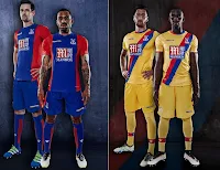
Crystal Palace.
BIG year for yellow.
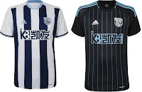
West Bromwich Albion.
I am not a big fan of prison-stripes and at first I thought Newcastle would have an action there but those are navy blue bars and I LIKE the Charlotte "Hornets" look in the Away kit. What nearly ruins both is the sponsor's logo. My God, what is that? But no, standards: for this market those are the best unis so far.
Arright, one more tonight. Oh my God, Leicester's up. Arright, Leicester, go.
Holy shit. Leicester, I gotta hand it to you. That royal/electric blue is AWESOME! And the gold crown dotting the "I", and the gold Puma. Gold pinstripes on the shoulders? Hard to see. Leicester, you're the champs and you've the Kit of Kings. Now don't fuck it up with your Aways.
Jesus Christ, let me grab my sunglasses. Okay! Those would have looked superb with gold. Why white? Whatever, you didn't fuck it up.
Arright one more. Try to end this on a down note. Hull:
I am not a fan of orange, but...that's not a bad orange! And I've already unburdened myself on vertical stripes but...those are spaced far enough apart that they look like panels or something. That's a pretty darn nice look. Until we come to the footwear. Is it mandatory to wear pink? I LIKE those! Sans sabot. Okay, quickly Away:
Not bad! Orange and black, orange and black, those are the colors that we will back.


